What your homepage should answer first
Someone new is deciding on their phone whether to visit, enroll or volunteer. They want three answers before they scroll, and most small organizations make them hunt.
Website basics
5 min read
The people who already know you rarely need your homepage. They come back for one thing: a date, a form, a phone number. The person who needs it most has never been to your place. They found you on a map, through a friend’s message or a search, and they are usually looking at a small screen in a parked car or on the couch the evening before.
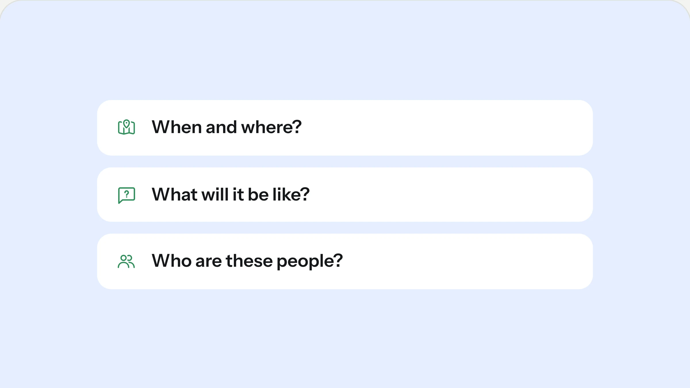
That visitor gives your homepage a few seconds. In those seconds they are asking three questions. If the first screen answers them, they keep reading. If it doesn’t, they close the tab and you never find out they were there.
1. When and where?
Opening hours, meeting times and the address belong on the first screen, in text, not inside a photo. Text can be read aloud by a screen reader, found by search engines and copied into a calendar. A time printed on a banner image can do none of that.
Write the details the way a person would say them:
A church: “Sundays at 9:30 and 11:15, 711 Haywood Road.”
A preschool: “Open weekdays from 7:30 to 5:30, on the corner of Elm and 4th.”
A food pantry: “Open Tuesdays and Thursdays, 3 to 6, side entrance on Mill Street.”
Link the address to a map so one tap starts directions. If you are hard to find, say how to find you. “Use the door next to the bike rack” saves a newcomer from the most awkward minute of their week, and it costs you one sentence.
If your times change during holidays or summer, say so in the same place. A short notice above the regular times (“No pantry on December 24, back on the 28th”) prevents the worst kind of first visit: standing in front of a locked door.
2. What will it be like?
New visitors worry about small, practical things. What should I bring? How long does it take? Do I need to sign up first? Will I be the only new person? None of these questions are big, but every unanswered one is a reason to stay home.
Answer them with one short line on the homepage and a fuller page behind it. The homepage line sets the tone (“Your first visit takes about an hour, and you don’t need to register”). The page behind it does the detail work:
How long a first visit takes
Whether to register in advance or simply show up
Where to park and which entrance to use
Who will meet them when they arrive
What to bring, and what not to bother with
Name that page after the visitor’s task, not after your organization chart. “Plan your visit”, “Your first day” or “How to get help” works better than “Information” or “About us”, because it promises an answer instead of a topic.
3. Who are these people?
People decide to show up for people. A real photo of your own team or community does more than any sentence about being welcoming. One honest picture of volunteers sorting boxes, children at a craft table or neighbors talking after a service beats a stock image of strangers smiling at a laptop.
The photo doesn’t need to be professional. It needs to be yours, well lit and recent. If you have nothing usable, ask someone with a decent phone to take ten pictures at your next gathering, with permission from the people in them. You will have your hero image by the end of the day.
Add one or two sentences in your own voice next to it. Not a mission statement, but something a visitor can picture: “We’re a group of parents and teachers who think four-year-olds should spend most of the day outside.”
If you only change one thing this week, move your times and your address to the top of the homepage.
What can wait further down
Your mission statement, your history, the full team list and the donation page all matter. They are second-scroll content. A visitor who has decided to come will look for them, and someone still deciding needs the three answers above first.
The same goes for news. A “Latest updates” section is useful for regulars, but it should sit below the essentials, and it should only appear if someone actually updates it. A news list whose newest entry is fourteen months old tells a visitor more about you than you would like.
Design the first screen for a phone
Most first visits happen on a phone, often straight from a map app or a link in a text message. On a phone, the first screen is much shorter than on a laptop. A large photo with a headline can easily fill all of it and push your times and address out of view.
Three habits keep the answers visible:
Keep the hero headline short. Seven or eight words is plenty. The details go in the sentence below it.
Put the most important button first, and make it say what happens: “Plan your visit” or “See opening hours”, not “Learn more”.
Make phone numbers and addresses tappable. A number someone has to copy by hand is a number they won’t call.
Then check the result on an actual phone, not only in a narrow browser window. Text that looks fine on a desktop often turns out to be too small, too long or hidden behind a cookie banner.
A quick test you can run tonight
Open your homepage on your phone. Don’t scroll. Then ask someone who has never been to your place to answer three questions from what they see:
When could they come, and where exactly?
What would happen if they came?
Would they feel welcome?
If they hesitate on any of the three, you know what to fix first. It is usually a matter of moving content, not writing new content.
How our templates handle it
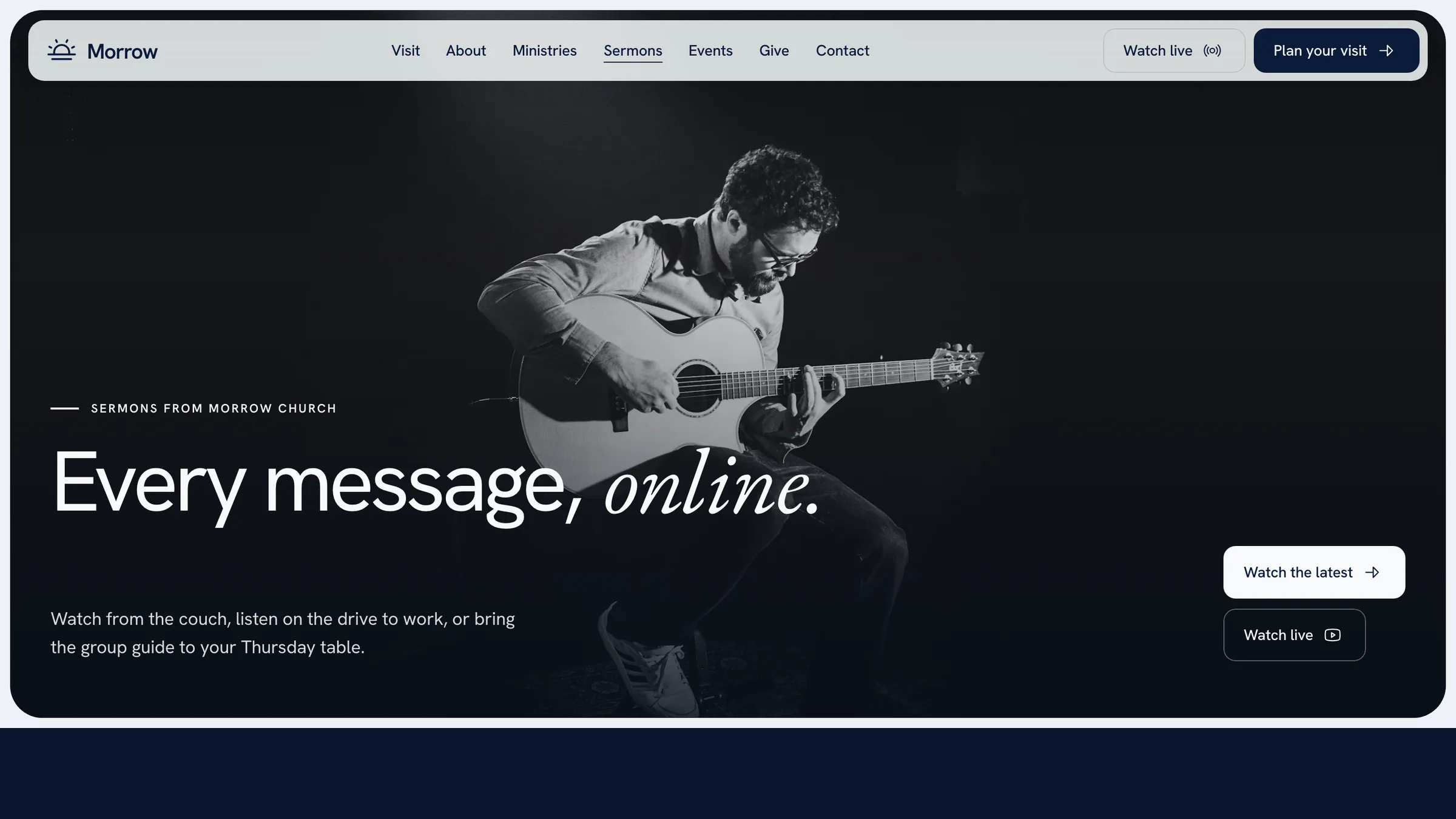
Every Sitewright template puts these answers in the first screen. In Morrow Church, for example, the service times sit in the hero sentence, the main button leads to a visit page with parking, kids and what to expect, and a holiday notice can be switched on in one click. You replace the demo details with your own, and the order is already right.
Rather have it done for you?
We set up your template with your words, photos and domain in five business days, for a fixed price.
Keep reading